The Science Behind Colour Grading and Monitors

This is an article by our colourist Alexis Odiowei explaining the science behind colour grading and monitors.

IMG_2600“I want it to the look the same on every screen it is viewed on.”

This is the impossible task that colourists the world over often find themselves confronted with by agencies, clients and directors.

Over the course of this blog I will detail in simple terms why this is ultimately unachievable.

The best place to start is to give a brief summary of the science and technology that dictates the way that we view color on different monitors. Various video cameras shoot in different color spaces that can be utilized for different reason at the various stages of post production but the current colour space or standard for television broadcasting is known as REC709. Every TV Broadcast colourist will be working with a broadcast monitor that is calibrated to REC709. Most consumer HDTVs are also roughly calibrated to this standard.


So why does it look different on my TV at home?

The most simple way of explaining this is to use a real life example that almost everyone will have experienced. If you have ever been into an electronics store and seen 3 or 4 televisions lined up next to each other all playing the same image you will have noticed that they all display the colour differently, some differences are very subtle while others may be more extreme.

One of the main problems is that most new HDTVs offer a multitude of settings ranging from dynamic through to sport and so on that enable the consumer to modify the picture they see on their television. Quite often televisions ship with one of these settings applied this can greatly distort the way that we see the image from grade to broadcast. This often results in an image that is drastically different from the work done in the colour grading suite.

Many people in the industry feel so strongly about the way that images are distorted through these TV settings that there are various petitions to ensure that TVs are shipped with standard settings. You can see a few articles on the subject below.

https://www.change.org/p/hdtv-manufacturers-please-stop-making-smooth-motion-the-default-setting-on-all-hdtvs

http://www.bbc.co.uk/news/technology-19650769

150226215539-black-blue-dress-exlarge-169

This picture was a recent internet phenomenon with many people seeing the dress as white and gold while others saw it as blue and black. This again shows how lighting situations brightness and different screens vastly effect the way cololur is perceived.


Ok well what about my laptop home computer?

Clients often ask colourists to send on a file that they can review and give changes on. This is every colourists worst nightmare as 90% of laptop and computer screens are not calibrated to any standard. On top of this if you are using your laptop for work purposes (word, excel etc) chances are you have adjusted the brightness settings to your liking. So often feedback in this way can be at best pointless and at worst damaging.

I can think of a recent example where I spent over a week going back and forth with a director making changes based on his laptop image, only for him to finally come in and approve the original grade that I had done at the beginning of the week.


So whats the point in color grading at all?

The thing about colour is that there are various things that affect the way we perceive it, whether it be lighting, back drop or adaptation (your eyes adjusting to an image after viewing it too long). We color grade to ensure that at it’s best the image is seen as closely as possible to how it was in the grading suite, however if it is not observed in this environment we are still greeted with an image that has an overall complementary colour pallet and doesn’t for instance become too dark in the black levels or have clashing colours.

Overall the small differences between televisions set at a REC709 standard will have very little impact on the viewers experience providing the colorist has carried out their duties properly.

So to conclude the key is not to worry about whether it’s going to look exactly the same on every screen. It’s not going to! The main thing to take into account is the medium your project is destined for and employing a colourist that can ensure that the image is going to look good in this medium regardless of the subtle changes between the various screens it will be viewed on.

ARTICLE BY ALEXIS ODIOWEI

Quirky Virals for Samsung Note 4!

For this project, our team had to complete the post-production for a series of virals for Samsung Note 4 featuring Vietnamese celebrities, Ha Anh (model), Ha Anh Tuan (Singer) and Anh Tuan (MC).

The requirement was simple. 8 viral videos in 1 week. Sounds simple. But throw in some high quality motion graphics designs and visual effects and the task gets interesting.

All 8 videos were shot by the talented team at 116 Pictures in an unbelievable 2 days flat. The films looked simple, yet each film has quite a bit of compositing as the scenes were all shot in green screen.

The chosen tool for online was Autodesk Smoke 2015 with Senior Online Artist, Rahul Kallankandy, tasked to take on the challenge.

“Even though the videos were meant to be viral videos, we approached them as full-fledged commercials. Overall the experience was exciting and an example of how a well organized, collaborative effort can produce stunning works within the tight deadlines.”

Thanks to the seamless communication with 116 pictures and their vision, Digipost was able to successfully deliver all 8 films with ease.

Check out the videos on the Samsung Vietnam YouTube channel below:

CREDITS:

Client: Samsung
Product: Note 4

Agency: Cheil Communcations/ MASH

Production House: 116 Pictures
Executive Producer: Gordon Westman
Producer: Lan Pham
Director: Sunil Thomas

Post Production: DIGIPOST
Executive Producer: Andy Ho
Producer: My Nguyen
Editors: Lloyd Bishop, Trang Nguyenh
Assistant Editor: Tuan Minh Anh
Colorist: Alexis Odiowei
Online Artist: Rahul Kallankandy
Motion Graphics Artist: Leonard Monichi, Trinh Lam, Thinh Vu
Sound Designer & Mix: Chris Skipper, Quyen Phan

Giant Winter Melon lands on the beach of Vietnam!

Outlandish commercial with a giant winter-melon falling from space. The 3D team had to conceptualize the ‘Winter Melon spaceship’ and animate the growing tree.Ā  In online, a lot of work went into creating the ‘scorching heat’ using visual effects of heat waves and also lens flares.Ā  There was also much focus on the sound design.Ā  The sound effects was done meticulously in order to enhance the atmosphere and situation.

Client: Tribeco

Production House: Blue Storm
Executive Producer: Steve McLennan
Creative Director: Thuy Phan
Director: Marc El-Ayari

Post Production: Digipost
Post Producer: Nguyet Thai
Editor: Antonio Aleixo
Colour: Cyrel De Los Reyes
Online Artist: Rufus Blackwell
3D: Dai Phuoc, Phung Lieu, Linh Tran
Sound Design & Mix: Toan Trinh

VFX & Design of So Yumm TVC


The Director, Yeong Li Wai, for this commercial came to us with the VFX challenge to re-create an computer-game scenario. Inspired by the action sequences from Scott Pilgrim vs. the World and fighting games added with a slapstick element, the aim was to appeal to kids’ imaginations.

The team had to develop an imagined environment for the arena, and a dome-like futuristic structure was created in 3D as envisioned by the Director. Flares were added for a more dramatic effect.

Josel Dela Cruz, our very own in-house Motion Graphic Designer, drew influences from old fighting games and incorporated them together with styles from kids anime. The idea was to have a graphical design that is fun and light.

Marlon Bondoc added the final touches in the online stage.

Check out the final product!

Client: J.F. Vietnam
Product: So Yumm Sausages

Production House: Echo Production
Executive Producer: Lien Dang
Director: Yeong Li Wai

Post Production: Digipost
Producer: Nhu Doan
Offline Editor: Cyrel Reyes
Colour Grade: Cyrel Reyes
3D: Dai Nguyen
Motion Graphic Designer: Josel Dela Cruz
Online Artist: Marlon Bondoc
Music: MIDI Studio
Final Mix: Nikk Eu

LEO ‘The Sun’

One of the fun pieces we did so far this year, this commercial was for the launch of the Leo drink to appeal to the youths of Vietnam. This project was directed by Martin R. Wilk.

For the offline, Cyrel De Los Reyes edited with dynamic shots and quick cuts to bring out the energy and vitality of the youths today.

Our Senior Online Artist, Rufus Blackwell, had to achieve a ā€˜old-schoolā€™ Kodachrome look in the grade and online. Vignettes, flares and flickers were further utilized to create the final product.

The final icing is the music composed by Nikk Eu, which was an alternative rock piece to excite and hype up the mood.

Feast your eyes and enjoy!

Kangeroo Mobile ‘Elevator’

We decided to feature this TVC as this is a very different treatment from other local commercials. Directed by Martin R. Wilk, the main highlight of the commercial is to showcase the ‘long battery life’ of the Kangeroo Mobile phones.

This commercial was edited on Final Cut Pro and graded on Apple Colour with the Tangent CP200 by Cyrel De Los Reyes. Online was done on Autodesk Smoke by Marlon Bondoc and Sound Designed by Nikk Eu on ProTools.

“The edit is an edgy narrative with a twist. This is the only commercial I cut in Vietnam that has black frames in the final edit! For the colour, I used a lot of greens and yellows, and also pushed up the contrast of the shadows to create that gritty toneā€¦”
– Cyrel

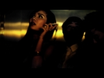
The online process required lots of retouching and adding reflections on the elevator’s metallic surfaces. Also the shot with elevators buttons had to be re-created by compositing different shots together.

The result is an unique and dynamic commercial, one of our editors’ favorites!

Check out the TVC!